Project Overview
The intranet homepage serves as a central platform for all employees to quickly and efficiently access important resources and information. It acts as a focal point for communicating current company news and provides access to relevant documents and essential applications.
The challenge in designing this is to gather the diverse requirements of everyday use and subsequently create a design that ensures easy accessibility and user-friendliness for all specific use cases.
Challenge
-
User interviews across the company with cross-section approach
-
Qualitative analysis of the interviews
-
Ideation and conception of the new homepage
-
Implementation of the new ideas as a clickable prototype
Objectives
-
The intranet design was last updated three years ago when the company was considerably smaller and faced different challenges.
-
The page no longer provided adequate entry points or quick links.
-
In addition, various modules were not functioning properly and needed revision.
Problems
Approach
01.
Research & Analysis
02.
User-Centrics
03.
Conceptualization
04.
Prototyping
01. Benchmarking & Analysis
Benchmarking the market and analysing existing systems are essential at the start of a project in order to create a sound basis for the next steps. This is the only way to gain an insight into current trends and fully understand the possibilities of the project. The research enables you to gain general insights into comparable products, challenges and best practices. By analysing the existing system, you gain a better understanding of customer needs and obtain references for the development and optimisation of the system
Benchmarking
I have read various reports and looked up various examples of intranets to analyze their comprehensive features. This process has provided me with a variety of insights and ideas. The most important ones are
1. Current Content
Employees should stay up-to-date and be able to quickly inform themselves about relevant announcements and company developments.
2. Corporate Culture
Emphasis on corporate culture and a focus on the needs and experiences of employees.
3. Social Function
Integration of features that promote social interaction and collaboration among employees.
4. Efficient navigation
Implementation of an intuitive navigation and a powerful search function to enable users to quickly find information.
5. Reporting
Implementation of reporting features to measure the performance of the intranet and continuously improve it

6. Appealing Design
Design of a contemporary and appropriate intranet layout to ensure an attractive and appropriate self-presentation.
Analysis of the existing website
In line with the classic UX saying 'Your old site is the best prototype of your new site,' I thoroughly analyzed the structure and functionality of the old website, creating abstraction forms of functional representation


This process brings weaknesses and potential improvement areas to the forefront. It also leads to the identification of proven elements. This forms the foundation for an optimized new design.
02. User-Centrics
I prepared and conducted user interviews to gain insights into the needs, behaviors, and expectations of different user groups. The individuals were selected to represent five different career levels and various departments. This approach helps capture a broad user perspective, identify issues, and design user-friendly solutions for various use cases.
"...what you definitely don't find on the homepage, at least not really, is information for everyday work that you actually use."
"The mix of interesting information is what makes it - but it should be better subdivided."
"The news sliders are really stupid because they usually only show the oldest article. I Besides some pictures which help to quickly understand what the articles are about would be quite useful"
"During the analysis of the interviews, I carefully examined and categorized the collected information. My approach was to extract key statements, cluster them, and identify trends in the participants' responses. This allowed me to recognize both commonalities and differences among the statements of various participants

03. Concept
This is where the functionality and fundamentals of user experience and website design are established. Insights from the previous phases are translated into user-centric solutions, and ideas are sketched for the first time. It's the moment when the vision takes shape and transforms into clear, structured plans. Through creative processes, feedback, and iterations, a framework emerges, laying the foundation for the design and setting the course for the successful progress of the project.
Product vision
The goal is to implement a user-centric redesign that focuses on clarity and rich information diversity. With a fresh approach, the user experience is intended to be improved. Furthermore, it should be ensured that the intranet homepage serves as a central hub where relevant and meaningful information is easily accessible. The following principles are crucial:
-
Clear categorization of news
-
Focus on up-to-dat news
-
Meaningful images and concise headlines
-
Improved usability of the news slider
-
Optimal information accessibility
-
Focus on user-friendliness and data privacy
-
Modern and clear design
This product vision will guide the work. The aim is to create a homepage that inspires, informs, and enhances productivity for employees while laying the foundation for a positive and productive corporate culture.
Wireframes
The initial stages of ideation as usual began with pen and paper wireframes.

Idea 1
The most important news is displayed in sliders at the top, oriented to the left. A personalized column fills the right part of the screen, clearly standing out from the rest

Idea 2
The most important news fills the Hero Section, providing a clear top-down news-oriented structure to the page. Personalized, as well as customizable features, are arranged below.

Idea 3
This page features a two-part design, with the modules arranged in the accustomed reading direction based on their relevance. The news modules come first, followed by personalized content, and then the customizable modules.
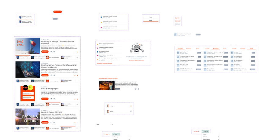
Once the fundamental decisions were made, I implemented the concept based on Idea 1 as a Lo-Fi Wireframe. In this process, I also developed an altered version of the main news slider that ensures accessibility and provides a much clearer preview of upcoming news.

For the adaptability of the website, I developed two different screen views. One is optimized for standard laptop screens with a size of 13 inches (approximately 33 cm), while the other also considers larger external screens with 27 inches (approximately 69 cm).
Mobile devices were not considered in the design, based on insights from user interviews.

04. Prototyping
In the prototyping phase, the concept becomes tangible reality. Ideas are brought to life and transformed into functional prototypes that illustrate the user experience. It is the phase in which concepts can be tested, revised, and optimized to ensure they meet user needs. Through these iterative processes and user-centric adjustments, prototypes are developed to serve as the foundation for implementation.
Designsystem
This is the design system I compiled and used.
It serves as a reference for future design and as the basis for collaboration within the team.
Prototyp
At the end of the project, there is a multifaceted and well-thought-out result in the form of a clickable prototype. Summative user testing and further development were omitted in this project at the customer's request.
.jpg)
Final thoughts
With the final prototype, I successfully achieved all the goals formulated at the beginning. In close collaboration with the frontend developer, subtle adjustments were made to ensure that the envisioned usability features are implemented optimally. The positive feedback from the client and the launch of the redesigned homepage on January 1, 2024, affirm the success of my work.
Throughout the project, it once again became evident that the key lies in a solid, user-centered approach and the consistent questioning of initial ideas, coupled with an ongoing iteration process
Next steps
Next, I plan to create a short explanatory video about the website's new features in collaboration with the client's video department. The goal is to enable all employees to make the best use of the website.
Additionally, the website performance will be monitored using specific metrics such as loading times, the frequency of use of certain features, and potentially the reduction in the frequency of using the search function. This is done to validate the design and make further improvements if necessary.
In the realm of UUX, there is always room for enhancements, and projects are never 100% complete. Unlike this report of my project, which I am concluding here :)