Project overview
Challenge
The German Federal Ministry of the Interior (BMI) commissioned the development of a national portal for residence permits in just six months. The existing analogue processes were inefficient, error-prone and a burden for applicants and authorities alike.
As the primary point of contact for UX, my central strategic challenge was to embed usability in this time-critical government project. I had to quickly build a deep, evidence-based understanding of the needs of all user groups. Only then could we ensure we were solving the right problems and align the entire cross-functional team on an effective and impactful MVP.
Objectives
-
Significantly reduce the time from application submission to decision for all parties involved.
-
Create a positive, transparent, and comprehensible experience for applicants.
-
Establish a unified, scalable, and accessible platform for all of Germany.
Problems
-
Complex processes and incomprehensible official language as significant access barriers.
-
Previous 1:1 digitization of paper processes.
-
An intransparent process that generates a high support burden.
-
High error rates and inefficiency due to media discontinuities and manual data transfer.
Project scope
-
Process analysis
-
Problem definition & strategy
-
Concept & design
-
Validation & iteration
-
Implementation
Duration
-
June 2024 - November 2024
Role
-
Solo UX
Tools
-
Jira
-
Microsoft 365
Approach
01.
Process analysis
02.
Problem definition & strategy
03.
Concept & design
04.
Validation & iteration
05.
Implementation
01. Process analysis
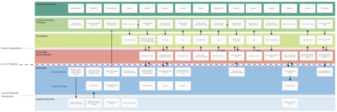
Through a Contextual Inquiry, the real workflows and system breaks were uncovered. These insights were visualised in an As-Is-Service-Blueprint, which served as the common data foundation for all subsequent strategic decisions.
To create an evidence-based foundation for the project, the first step was a multi-day Contextual Inquiry that I planned and led at the Ausländerbehörde Potsdam. Instead of relying solely on existing requirements documents, we accompanied caseworkers as they handled real cases. This systematically documented the authentic workflows, informal workarounds, and actual system breaks in their daily work.
The qualitative data collected was then prepared to meet the different information needs within the project. A comprehensive As-Is-Service-Blueprint visualized the entire end-to-end journey and served as the central strategic basis for discussion. In parallel, all detailed notes were provided in an organized form to enable subject-matter experts and other stakeholders to conduct a deeper analysis of the details. In particular, the blueprint quickly established itself as the central “single source of truth,” thereby creating the objective basis for the subsequent targeted problem analysis.
02. Problem definition & strategy
Based on the Service Blueprint, the pain points were mapped, systematically analysed and clearly highlighted using a heatmap. Building on this, I developed a focused strategy that concentrates on addressing the core problems to create the greatest value for applicants and caseworkers.
The created Service Blueprint served as the direct basis for locating the pain points identified in the research on the process map. Based on the density, frequency and severity of these problems, a heatmap was produced. This method visualised the most critical problem areas and provided an objective, data-supported basis for strategic prioritisation. The analysis crystallised the following core problems:
1. Selection of inappropriate application types due to complexity and incomprehensible official language.
2. Missing or incorrect documents in the application, leading to inefficiency during appointments and repeated visits to authorities.
3. Due to a lack of status transparency, there was a high volume of enquiries by email and phone from applicants.
4. Caseworkers likewise lacked a structured way to ask follow-up questions, which further increased the communication effort.

Rather than losing ourselves in detail, this data-driven approach enabled a clear opportunity framing. We did not ask “What is all broken?”, but rather: “Where can we achieve the greatest positive impact with targeted interventions?” A deliberate decision was made to postpone complex issues that required legal analysis, such as application type selection, to a later phase, since otherwise this would have jeopardised our six-month timetable. The result was a clear, data-driven prioritisation of areas for action, which became the strategic basis for our MVP concept.
03. Concept & design
With the strategy in place, the first screens addressing these benefits could be created: initially as wireframes and then progressively refined. It was necessary to build logged-in areas (process flow, application journey) and non-logged-in areas (homepage, product pages, etc.) for applicants, as well as a complex area for caseworkers to enable simpler, more efficient and more transparent pre‑screening of applications — in short, an end-to-end portal.
Building on the prioritised strategy, I developed the “To‑Be” concept, which addresses the identified core problems through targeted interventions. A wizard ensures correct application eligibility, while a digital, dynamic application flow increases the quality of submissions.
A particular focus was on efficiency for caseworkers: a central casework application was designed to enable document verification, matching with register data and requesting missing documents with minimal effort. For applicants, a personal user account provides the necessary process transparency. The implementation of these strategic concepts into detailed and accessible designs is presented below.
3.1 Applicant-facing pages


The design for the applicant view had a clear focus on guidance, simplicity and transparency. A guided application assistant eliminates the complexity of bureaucracy and directs users safely to the correct outcome.
3.2 Caseworker application


Unlike the public view, the specialist application for caseworkers was consistently optimised for efficiency, error‑free actions and information density. This structure supports the workflow “from overview to detail”: a central case overview enables prioritisation of all applications, while a case detail view consolidates all relevant information for efficient review. There are specialised modules, such as the module for follow-up requests, which are designed so that complex actions can be performed with few clicks and minimal effort.
Turning the designs shown above into a consistent, high‑quality product required the development of two dedicated design systems. In close collaboration with the responsible UI designer, I was involved in building these systems. The deep insights gained into the system architecture in Figma were not only personally valuable but also created the foundation for the scalability of the entire product.
04. Validation & iteration
In a three-stage process the concept was validated with subject-matter experts and caseworkers to check the process logic, the usability and, finally, design details. The insights gained were fed directly into iteration loops to ensure the practical suitability of the end product.
Validation of process logic

In initial workshops with experienced caseworkers the fundamental Service Blueprint was validated. The goal was to ensure that the designed process and validation logic corresponded to the complex working reality in the authorities.
Using Mid-Fi Wireframes, we tested the basic usability of the system in a second phase. The focus here was on the efficiency of core workflows and intuitive navigation within the specialist application.

Validation of usability
Polishing the
final designs

In a final round, the Mockups were used to review and optimise details such as the clarity of terminology, the clarity of instructions and the visual hierarchy.
Hero-Moment: The original project scope did not include tests with applicants, only validation by internal subject-matter experts. I identified this as a critical project risk and persuaded project management that legal correctness is secondary if applicants do not understand the portal. That would lead to incorrect applications and increased support demand, thereby undermining our core objectives. By proposing a pragmatic, cost-free test plan, I secured the necessary Buy-in to validate our designs with real users.
05. Implementation
The transfer of the concepts into code was carried out in close, iterative coordination with the development teams. Thus i was the only UX designer working in scaled Scrum processes according to Nexus, collaborating with several development teams. My primary task was to bridge the conceived user experience and technical feasibility.
What worked well: the design system as a common language
The established design system proved to be a decisive efficiency driver. By resolving the fundamental UI questions, it freed up me and the developers to focus on what mattered: the correct implementation of the complex User Flows and the caseworkers’ validation logic.
Challenge: Static screens cannot represent behavioural logic
When I realised that static mockups were insufficient to convey the dynamic behavioural logic, I initiated short, the "Daily-Design-QA-Sessions" for all developers. These were not about criticising their work but served as a collaborative forum to ensure the interaction logic was put to action the right way. This simple daily exchange drastically reduced rework from Devs, saved time for me answering question and ultimately closed the gap between design intent and final code.
Lessons learned:
The code is the final, truthful prototype of the user experience. My role is not merely to deliver a well thought concept, but to accompany the implementation of the user experience. This shift from documentation to continuous, interactive dialogue about the implemented experience. This was key to delivering a high-quality MVP within the ambitious timeframe. Only if UX & DEV works together early and closely we are able to deliver the intuitive and fault-tolerant experience the users expects.
Results & outlook
The MVP was successfully delivered within the ambitious six-month timeframe. This success and strong client satisfaction led to a direct follow-on contract and the gradual expansion of the portal.
Already in initial pilot phases the user-centred design showed significant impact:
-
The number of incomplete or incorrect applications fell significantly.
-
The number of wrong documents in an appointment dropped to zero.
-
Subject-matter experts were relieved by a noticeable reduction in clarifying calls and emails.
-
In Summary: Processing time per application was drastically reduced. For a core process, average time dropped from around 30-90 minutes over a couple of appointments to an effort as few as 37 clicks (in the best case scenario).
The successful MVP is only the first step. The scalable architecture of the specialist application and the established design system form the basis for a future nationwide rollout. Next strategic steps include integrating further municipal specialist procedures and expanding the portal with additional residence permits and services, bringing Germany closer to the goal of a fully digitalised administration for migration.